1. Introduction
I would guess that whoever you are, if you were to be told
that all the 0.75 °C increase in global temperatures over the past 150 years
was due to the increase in anthropogenic greenhouse gases but that temperatures
over the next three decades would increase by only 0.1 °C you would have mixed
reactions. If you were a sceptic you would scoff at the suggestion that
greenhouse gases could have such an impact but welcome the suggestion that
temperature would only increase marginally. On the other hand if you had built
a career, as a climate scientist or a politician, preparing people for large
temperature increases you would be horrified at the idea of small temperature
increases but be more sanguine about the attribution of the temperature
increase to greenhouse gases.
What I describe is a model which seems to suggest that this
is in fact the case. Whilst I can’t really believe it myself, I can’t find
anything wrong with it. Maybe you can.
This post is about the Atlantic Multidecadal Oscillation
(AMO) and its impact on climate.
The AMO is a climatic oscillation with a periodicity of
around 60 to 70 years based on the difference between sea temperatures in the
North Atlantic and detrended sea temperatures. There are several slightly
different definitions. A typical one is based on the difference between the sea
temperature in the part of the Atlantic Ocean from the equator to 70°N and the
global sea temperature.
Figure 1.1 shows the AMO from 1856 to 2011 based on the work
of Enfield et al (2011), downloaded from http://www.esrl.noaa.gov/psd/data/correlation/amon.us.long.data.
This version is based on Kalplan sea surface temperatures.

There are other oscillation with different periodicities and
definitions. Probably the best known of these is ENSO, El Niño/Southern
Oscillation. Others include the Pacific Decadal Oscillation and the North
Atlantic Oscillation. Whilst these posts will deal primarily with the AMO I
will also be considering other oscillations.
The reason that climatic oscillations have attracted
attention is because of teleconnection. This refers to the fact that climate
changes can be observed in parts of the world remote from the locus of an
oscillation but which appear to be related to it. This effect was first
identified by Walker (1923) in relation to the Southern Oscillation but similar
teleconnections are reported for the other oscillations.
At this point it
might be appropriate to introduce a small caveat. Although the timing of a
variation in climate might appear to be linked to an oscillation it does not
follow that the oscillation caused the climate variation. It is perfectly
possible that another phenomenon caused both the variation and the oscillation.
The word oscillation implies a regular pattern or variation and although I use
the word ‘oscillation’ throughout this article I recognise that the term
pseudo-oscillation might be more appropriate. Some of the oscillations which
occur over a short time period, a few years in the case of ENSO, are clearly
not regular. For the AMO the length of the data is not long enough to establish
how regular it is. A similar caveat applies to the use of the word ‘periodicity’.
Many of the sections in this article will be looking at a simple
model of global temperature in which the AMO is a parameter. Figure 1.2 shows
the simulated and observed global temperature.

I will
be looking at how this model was developed and some of the alternatives I
considered. I will also be looking at the connection between the AMO and
hurricanes and sea level.
2. Why are temperatures tending to increase?
The graph of temperature in the preceding post (figure 1.2) shows
that they have tended to increase since the start of the global temperature
record. In this post I am using the HadCRU3T global data, downloaded from http://www.cru.uea.ac.uk/cru/data/temperature/.
This is the longest of the main global temperature indices and takes account of
both sea and land temperatures.
The question of why temperatures are increasing is one of
the key questions related to climate change. In particular, is the increase due
to human influence or is it natural?
Here I consider three possibilities:
- Greenhouse gas forcing. The 1995 IPCC report contained the sentence “The balance of evidence suggests a discernible human influence on global climate.” So, this is obviously one of the main candidates. In this case I use Greenhouse Gas Forcing (GHGf). For radiative forcing by GHGs I consider CO2, CH4, NO2, CFC11 and CFC12. These five gases account for most forcing by GHGs. The main anthropogenic forcing records I used are produced by the Goddard Institute for Space Studies (GISS) (Hansen and Sato, 2004). The data for 1850 to 2000 is in the file ‘GHGs.1850-2000.txt’ and for 2001 to 2004 in the file ‘GHGs.Obsv.2001-2004.txt.’ More recent data on the five gases were downloaded from the Earth System Research Laboratory data finder (http://www.esrl.noaa.gov/gmd/dv/data/ ). In most cases the data were simply added to the previous series. In the case of CH4 a small adjustment was made for compatibility with earlier data. As CH4 data for 2011 had not been released at the time of writing, and as all other data sets included that year, CH4 data for 2011 were estimated based on previous years. The radiative forcing effect of the gases was calculated using the formulae in IPCC 2001, Table 6.2. The CO2 equivalent, CO2e, was calculated by inverting the formula for CO2 forcing but using the total radiative forcing from all 5 gases. The GHGf is in units of W/m2.The increase of GHGf is shown on figure 2.1.
- The next alternative is total solar irradiance (TSI). Solar irradiance data derived from satellite measurements are only available from 1979. However TSI is strongly correlated with sun spots and this fact has been used for the construction of a long series of TSI data. The data I used were based on the work of Wang et al [2005] and downloaded from http://lasp.colorado.edu/sorce/data/tsi_data.htm. These data are also shown on figure 2.1.
- A further suggestion is that the increase is due to ‘natural causes’; for example a hitherto unquantified oscillation with a long periodicity which is going through a rising phase. To replace that I assumed a linear trend represented by the year number.

Both forms of forcing shown on the figure are expressed in
W/m2 and to the same scale except for one important fact: the GHGf scale
goes from 0 to 3 W/m2 whereas TSI goes from 1360 to 1363 W/m2. Whilst has TSI has fluctuated in a narrow band around 1361 W/m2 in the period used for calibration there is evidence that longer cycles (Gleissberg, circa 87 years: Suess, c 210 years: Hallstatt, c 2300 years) might least to larger changes.
Another difference between these two forms of forcing is that whereas GHGf increases almost continuously, TSI falls to a minimum about 1900, increases to a local maximum around 1960, and then remains more-or-less constant. Data for all variables are available from 1850 to the present.
Another difference between these two forms of forcing is that whereas GHGf increases almost continuously, TSI falls to a minimum about 1900, increases to a local maximum around 1960, and then remains more-or-less constant. Data for all variables are available from 1850 to the present.
The first single parameter regression model I look at is of the form:
Temperature = a *Trend forcing +b
Where:
-
Temperature is the HADCRUT3 global annual temperature,
-
Trend forcing is GHGf, TSI or the year number.
-
a and b are coefficients determined by linear
regression.
The following table shows the results of regressing global
temperature against each of the three forcing agents in turn.
R2
|
Explained
Variance
|
|
Linear trend
|
0.64
|
42.6%
|
GHGf
|
0.77
|
70.2%
|
TSI
|
0.27
|
-165.9
|
As can be seen GHGf provides the best fit. This does not, of
course, prove that the trend is due to GHGf, but does suggest that the timing
and magnitude of the underlying forcing is closer to that than to a linear
trend or to TSI. In case the correlation of temperature with TSI was reduced by
the irregularity of the TSI compared to that of GHGf, I also regressed
temperate against TSI smoothed with an 11-year moving average. The R2
and explained variance did both increase but only to 0.55 and 17.8%.
Figure 2.2 shows observed temperature, calculated
temperature using GHGf and the residual.

The calculated temperature represents the trend but captures
very little of the remaining variation. The residual has zero mean and a trend
against time of -0.00013 °C/year, equivalent to ‑0.02 °C for the 160 annual
time steps in the data. In other words the use of GHGf as a parameter was able completely
to explain the rising trend in the data.
The residual from this simple one parameter model appears to
oscillate which suggests that one or other of the oscillations as parameter
might explain some of the remaining variance. Which of them explains most, will
be discussed below.
It is perhaps necessary to expand on the point I made above
regarding the influence of GHGf on the trend. I do of course recognise that
regression does not prove causation however I also recognise that where a
factor, for other reasons, has been found to be important then a regression
model can help to quantify its importance. In the case of multiple regression, it
can explain the relative importance of each of the parameters.
Another factor I am aware of is that multiple linear regression
implies a linear relationship between the dependant and the independent
variables. Whilst this might be a valid assumption for the range of data used,
extrapolation should be used with caution.
In the above, and all subsequent regression equations, I
have used annual data without any lag between an independent variable and the
dependent variable. Where monthly regression models have been developed these
often include a lag but usually this is a few months only and is therefore not
significant with annual data. It is of course possible that climate responds to
forcing with a lag of years or even decades and this is a point I will return
to later.
3. How do cycles influence the climate?
For the next step I add an ‘oscillation’ to the model. Figure 3.1 shows 4 major oscillations for the
period 1900 to 2011, the longest period with data for all the oscillations. They
are defined as follows:
- Atlantic Multidecadal Oscillation – AMO – the difference between northern Atlantic temperature and detrended temperatures. Data are available from 1856 download from http://www.esrl.noaa.gov/psd/data/correlation/amon.us.long.data .
- North Atlantic Oscillation – NAO – the difference in pressure between Reykjavik (Iceland) and the Azores. Data are complete from 1825 to the present, downloaded from http://www.cru.uea.ac.uk/cru/data/nao/nao.dat.
- El Ñino/Southern Oscillation – ENSO – the multi-variate ENSO index (MEI) is based on 6 variables: sea-level pressure (P), zonal (U) and meridional (V) components of the surface wind, sea surface temperature (S), surface air temperature (A), and total cloudiness fraction of the sky (C). This index runs from 1950 to the present. The extended index runs from 1850 to 2005 and is based on sea level pressure and sea surface temperature only. I prepared a composite index using mainly the extended index up to 2005, downloaded from http://www.esrl.noaa.gov/psd/enso/mei.ext/ , with data from the MEI for recent years, downloaded from http://www.esrl.noaa.gov/psd/enso/mei/table.html, adjusted to be compatible with the extended index based on the period of overlap.
- Pacific Decadal Oscillation – PDO – is defined as the leading principal component of North Pacific monthly sea surface temperature variability (poleward of 20N). Data are available from 1900 to the present downloaded from http://jisao.washington.edu/pdo/PDO.latest .

The figure shows that the AMO, as in figure 1.1, has a
periodicity of around 70 years and, when smoothed with an 11-year moving
average, appears to be the most regular of the oscillations. The NAO, covering
a similar geographic region to the AMO but based on pressure rather than
temperature, shows little synchronicity with the AMO. There does however appear
to be some negative correlation with the ENSO, with local maxima in the one
occurring at the same time as minima in the other. This is the converse of the
case of the PDO and ENSO where the short term oscillation of the ENSO appear to
be superimposed on the longer periodicity of the PDO.
Some of this is confirmed from the cross correlations of the
four oscillations shown in table 3.1.
Table 3.1 - Cross
correlations
|
|||
AMO
|
PDO
|
ENSO
|
|
NAO
|
0.054
|
-0.091
|
-0.107
|
AMO
|
0.010
|
0.105
|
|
PDO
|
0.600
|
||
Most of the cross correlations are low. The one exception,
as could be expected from figure 3.1, is that between the PDO and ENSO.
In section 2 I considered the main factor behind the
underlying trend in temperatures. I noted that the residual appeared to be
cyclical suggesting that an oscillation might explain some of the residual. I
now extend the regression model to one with two parameters: GHGf and each of
the four oscillations in turn. Table 3.2 shows the explained variance with each
of the oscillations.
Table
3.2 – Explained variance with the addition of an oscillation to the model
|
|
GHGf plus …
|
Explained variance
|
AMO
|
88.7
|
NAO
|
72.0
|
PDO
|
73.8
|
ENSO
|
77.2
|
This table shows that including the AMO produces the model
which explains the highest level of variance in annual global temperatures.
In the previous section the model with only GHGf explained
70.2% of the variance in temperature. This value is not directly comparable to
table 3.2 as the first model used 156 years of data and this model 111 years of
data, however it is clear that introducing the AMO has greatly increased the
accuracy of the simulation. The equivalent figure for the full 156 years of
data is 88.4%.
To examine whether the effect of the AMO on temperature is delayed or whether the AMO is driven by temperature changes tthe data were displaced by one year in each direction and the parameters recalculated. In one case the accuracy fell to 82.5% and in the other to 78.5%. In other words the assumption that with annual data the impact is effectively coincident is valid.
To examine whether the effect of the AMO on temperature is delayed or whether the AMO is driven by temperature changes tthe data were displaced by one year in each direction and the parameters recalculated. In one case the accuracy fell to 82.5% and in the other to 78.5%. In other words the assumption that with annual data the impact is effectively coincident is valid.
4. Four Parameter Regression Model
The results presented so far have suggested that GHGf is the
main factor in explaining the underlying rise in temperature and the AMO
explains why the rate of temperature increase sometimes accelerates and sometimes decelerates. There are two other factors I have not so far included in the model.
The first is total solar radiation. I did consider it as driver of the
underlying increase and rejected it as an explanation. However it does have a
regular fluctuation and might explain some of the variation in global
temperature even if not the underlying increase. The second is optical
thickness. This is effectively a measure of the aerosols in the atmosphere and
reflects the influence of volcanoes.
In this model the parameters are:
- Temperature °C – HadCRU3T global temperature from 1850 to the present,
- Solar radiation - W/m2– Total solar irradiance(TSI) – 1850 to the present,
- Volcanic effect – Mean optical thickness(OT) – 1850 to the present, downloaded as http://data.giss.nasa.gov/modelforce/strataer/tau_line.txt.
- Forcing – W/m2- Greenhouse gases (GHGf) – combined effect of CO2, N2O, CH4, CFC12 and CFC11 from 1850 to the present,
- Oscillation – AMO from 1856 to the present.
The data are at an annual time step. They all come from
recognised sources. In most cases recent data are measured (at least to some
extent).
The parameters of the model determined by multiple
regression are:
Temperature = 0.0365*TSI -0.281*OT + 0.308* GHGf + 0.518 *
AMO -50.09
The simulated and observed temperatures are shown on Figure 4.1.
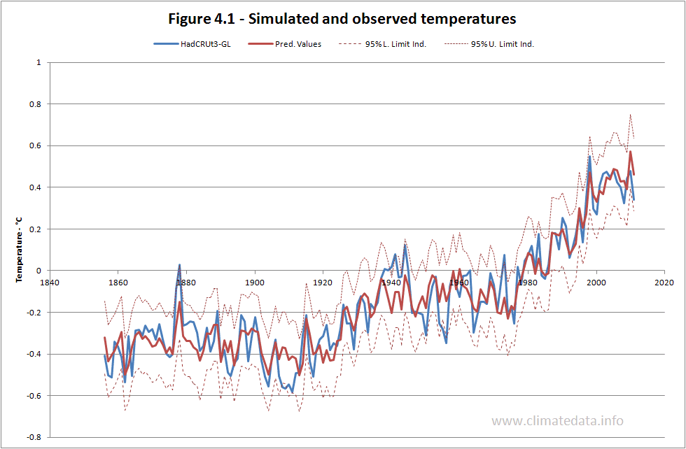
Visual inspection of the figure suggests that the model is
accurate for the whole period of simulation. In particular it picks up the
rapidly rising temperatures from 1910 to 1945 and 1976 to 2005 and the flat or
falling temperatures from 1875 to 1910 and 1945 to 1975. It also shows the
recent levelling off in the temperature increase. Perhaps surprisingly it also
simulates the high temperature in 1998 which was due to an El Niño event.
Table 4.1 shows coefficients and statistical measures of
goodness of fit.
Table 4.1 – Measures of goodness of fit
|
||||
Variable
|
Estimate
|
Std. Err.
|
Tstat
|
P-value
|
Intercept
|
-50.09
|
31.65
|
-1.58
|
0.1157
|
AMO
|
0.518
|
0.0401
|
12.9
|
<0.0001
|
OT
|
-0.281
|
0.346
|
-0.811
|
0.4184
|
GHGf
|
0.308
|
0.0116
|
26.64
|
<0.0001
|
TSI
|
0.0365
|
0.0233
|
1.57
|
0.1191
|
Other statistical measures
|
||||
R2
|
0.898
|
|||
F
|
332.9
|
<0.0001
|
||
Explained variance
|
88.7%
|
|||
The statistics suggest that the coefficients for the AMO and GHGf are most likely to be valid, those for TSI and the intercept (strongly influenced in this case by TSI) are probably valid but less certain, and that for OT (Aerosols) has the highest range of error. The validity of the model is examined in the next section.
The values of R2,
F and explained variance are high but this
does not of itself mean that the model is statistically valid.
First of all the
annual temperature series is highly auto correlated. What this means is that
the value in a given year is partly explained by the value in the previous
year, and not necessarily by the model.
A simple way of examining this was to include the previous year’s
temperature as an extra term in the equation. The coefficients with and without
the extra term are given in table 4.2, below. The R2 value increased
only slightly from 0.898 to 0.907.
Table 4.2 - Model with and without
lag-1 temperature
|
||||||
TSI
|
GHGforcing
|
Aerosols
|
AMO
|
Lag-1
temperature
|
Constant
|
|
Model
with lag-1 temperature
|
0.0311
|
0.235
|
-0.389
|
0.414
|
0.239
|
-42.
7
|
Basic
model
|
0.0365
|
0.309
|
-0.281
|
0.518
|
-50.1
|
|
In the model with the extra parameters
the coefficients of the original parameters are similar though in every case,
except aerosols, smaller, suggesting that their influence might be a bit less
than in the original model.
Another way of considering the
validity of the model is to look at its effective length taking account of
auto-correlation. In this case the effect length is around 8 years however the
measures of goodness of fit are so high that the model is still statistically
valid.
A final requirement is that the
residual (in effect the errors) should have zero trend and zero
autocorrelation. 4.2 is a plot of
the residuals.

In this case the
residual has zero trend but the relatively high auto-correlation of 0.483. This
suggests that model satisfactorily explains the trend but not all the variation
in temperature.
The above is just a
summary of a potentially much more detailed analysis: the conclusion is that
the model is valid but that that its accuracy may be less than appears to be
the case on a first glance at Figure 4.1.

The two most
important parameters in the model are GHG forcing, which explains the trend,
and the AMO, which explains why the rate of temperature change appears to
accelerate, as it did from 1910 to 1945 and from 1975 to 2005, and slow down,
as it did from 1945 to 1975 and as it appears to be doing now. Over its cycle the AMO changes temperature by
± 0.20 °C. The extended TSI data I have used shows a slight upward trend, which
is not as apparent in sunspot data, but the variation in temperature over a
cycle is only around 0.05 °C. The effect of aerosols, and indirectly volcanoes,
is minimal; less than 0.05 °C for Krakatau in 1882.
GHG forcing
The
use of GHG forcing as the parameter which, effectively, explains the underlying
trend is likely to be the most contentious (at least for some people). The
value of the coefficient is 0.308 °C/watt/m2. This is equivalent to 3.25 W/m2/°C. This is close the accepted value of 3.2 W/m2/°C
quoted by the IPCC (2008, Paragraph 8.6.2.2).


AMO
Several papers have described teleconnectioms between the AMO and geographical regions remote from its immediate locus. These cover large parts of the northern hemisphere and, in some papers, parts of the southern hemisphere. Whilst global temperatures and the AMO are mathematically linked (global temperatures include the effects of ocean temperatures and the AMO uses the difference between northern Atlantic and global ocean temperatures) published papers have considered it to be effectively independent of global temperature.TSI
The
coefficient for Total Solar Irradiance is 0.0365. Allowing for the fact that
the sun only ‘sees’ a disk and the albedo of the earth is 0.7, this is
equivalent to a global forcing of 0.208 °C/w/m2. This is similar to
the figure for GHG forcing and for which similar comments therefore apply. The 95% errors bands for this coefficient are so high, ±0.046, however that the true figure might be closer to the theoretical value.
Aerosols
This is an area
where there is no ‘right answer’, the IPCC reporting a wide range of values.
The effect is due to volcanoes which have both a cooling effect (blocking out
the sun) and a warming effect (heat absorption by black soot particles). The
value of the effects it simulates is on the low side but within the range of
IPCC models.
Components of Warming
The regression model allows the influence of each parameter to be calculated. The values for three periods are shown on figure 4.2.
Table
4.2 – Components of climate change
|
||||||
Period
|
Observed
|
AMO
|
Aerosols
|
GHGf
|
TSI
|
Total
|
1856 to 2011
|
0.748
|
-0.035
|
0.011
|
0.777
|
0.030
|
0.784
|
1911 to 2011
|
0.922
|
0.176
|
0.000
|
0.665
|
0.032
|
0.873
|
1976 to 2005
|
0.737
|
0.348
|
0.002
|
0.316
|
0.009
|
0.674
|
These figures suggest:
- For the full period of calculation, 1856 to 2011, virtually the whole increase has been caused by the increase in GHGs.
- For the last century, 1911 to 2011, 20% of the increase is due to the AMO and the remainder to GHGf.
- For the period of rapid temperature rise from 1976 to 2005, half the increase was related to the AMO.
- Aerosols and total solar radiation had very little impact on long-term temperature changes.
The warming from
1856 to 2011 due to GHG forcing is 0.777 °C. During that period CO2e increased
from 289.6 ppm to 464.1 ppm. This represents a sensitivity to CO2e doubling of
1.14 °C which is very close to the accepted figure of 1 °C – without water
vapour feedback. The figure for GHGf sensitivity of 3.25 W/m2/°C was
also without water vapour feedback. If all the temperature increase from 1856
to the present gives an overall sensitivity to CO2e doubling of 1.12 °C this
implies either that the sensitivity without water vapour feedback is lower than
generally accepted and part of the increase is due to water vapour feedback or
that there has been no water vapour feedback in the last 156 years. The latter
would be surprising as there have been three periods of rapid temperature
increase since 1850:
·
1858 to
1888, 0.54 °C, 0.18 °C/decade.
·
1911 to
1944, 0.70 °C, 0.21 °C/decade
·
1976 to
2005, 0.74 °C, 0.25 °C/decade.
I realise that the figure of 1°C for a CO2e doubling is less
than the widely quoted figure of 3°C and I look at some of the implications of
this in section 5.
Alternative values of the AMO
The
above uses the estimate of the AMO from NOAA’s Earth System Research
Laboratory, Physical Sciences Division. It was chosen as it the longest of
those available. There is an alternative from the University Corporation for
Atmospheric Research, National Center for Atmospheric Research which runs from
1870 to 2010. The two alternatives are shown in figure 4.4.

As
can be seen they are quite similar, particularly for later years when the data
are more accurate. The difference in temperature calculation using the
different indices is shown on Figure 4.5.

Both sets of calculated flows are similar for much of the period. The
main difference is in the period before 1950; with the NCAR value of the AMO
the minimum around 1910 and the maximum around 1945 are not as well
represented. This is to be expected from the form of the two AMO indices. Both
models represent the slowdown in temperature increase at the start of this
century. Table 4.3 shows coefficients for GHGf and TSI are similar those for
the AMO and aerosols are different. The explained variance and the R2
are lower with the alternative AMO index.
Table
4.3 – Coefficients with alternative AMO indices (1870 to 2011)
|
|||||||
TSI
|
GHGf
|
Aerosols
|
AMO
|
Constant
|
Explained
variance
|
R2
|
|
AMO-ESRL
|
0.038
|
0.307
|
-0.166
|
0.533
|
-52.08
|
88.5
|
0.897
|
AMO-NCAR
|
0.041
|
0.325
|
-0.553
|
0.333
|
-56.68
|
75.0
|
0.800
|
5. Projections and comparison of regression model with IPCC models
Comparison with IPCC models
This chart (Figure 5.1) shows simulations with the regression model and a
23-model ensemble (downloaded from http://climexp.knmi.nl).

Whilst
neither model fully represents the low of 1911 nor the high of 1944 the
regression model comes closest. Both models tend to increase for the period
1944 to 1960 but whereas the IPCC models have a rapid fall, due to the Agung
volcano, and then rise, the regression model represents the local minimum in
1976 well. Both models then have similar accuracy until the start of the present
century when the IPCC models show a continuing increase but the regression
model simulates the slowdown in the temperature increase.
Temperatures without GHG forcing
One of the arguments in support of the models presented in
the IPCC reports comes from a comparison of what the models simulated with GHG
forcing and what they simulate without this.
Figure 5.2 shows the estimate presented by the
IPCC and the estimate based on the regression model. The IPCC estimate was
digitised from figure 9.5 of the IPCC report of 2005. The observed data were
adjusted to have zero for the observed temperatures for the period 1950 to
2000.
The differences between the two sets of calculated temperatures are large. In the case of the regression
model the temperature without external forcing would follow the AMO derived
trend with a mean of zero but some small effect from sun spots and volcanoes.
In the case of the IPCC models the major positive forcing is from GHGs and the
major negative forcing is from volcanoes. The green line shows four major falls
in temperature, represented also to some extent in the regression model, and a steady
increase from 1900 to 1960. The big difference is from the mid 1970s onwards.
The regression model ‘shares’ the temperature increase between the AMO and
GHGf; the IPCC models not only assumes the increase is driven solely by GHGf
but at rate which also cancels out the large negative effect of volcanoes.
Projections
Much of the debate around climate change to date is about an
appropriate response to the high temperature increases projected by IPCC
models. If the projections of a temperature increase of 2 or 3 °C by the end of
the century are correct then the costs of mitigation and/or adaptation might be
justified; if the projections are overestimates then the costs are not
justifiable.
To make a prediction it is necessary to be able to predict
the forcing agents. I made three
predictions and the way I predicted the forcing agents is given below.
1. Calibration
from 1856 to 1933 (half the data period) and prediction from 1934 to 2011. The
AMO used a sine curve fitted to the full period of data. The TSI used a typical
sine curve but because of the irregular periodicity it was not fitted to
historic data. Perfect foreknowledge of GHG forcing and aerosols was assumed.
The synthetic curves are shown in Figures 5.3, for the AMO, Figure 5.4 for the
TSI.
2. As above
but calibration from 1856 to 1980 and prediction from 1981.
3. Prediction
from 2011 to 2040. Assuming the same synthetic AMO and TSI values. Aerosols
assumed to be zero. GHG forcing assumed to increase at same rate from 2012
onward as it did from 1981 to 2011.
Figure 5.3 shows the assumed curve for the AMO for
prediction. It was derived by fitting a sine curve to the AMO data. I am not,
of course, assuming that the AMO is that regular but as an estimate for a
prediction it is as likely as any other. The shape of the curve suggests that the
AMO might be at a peak and that it will decline over the coming decades;
certainly AMO index has levelled off in recent years.

For the TSI it was not possible to fit a sine curve as its
periodicity is not constant. I therefore developed a synthetic record which
retains many of the characteristics of observed TSI variations which is shown
on figure 5.4.

The first prediction was made in 1934, using half the data
to calibrate the model and half for the prediction. For this period the R2
value was 0.52, much less than for the whole period. The prediction gets the
general shape correct but underestimates the 2011 temperature. This was due
to the fact that the coefficient for GHGf was 0.242 °C/watt/m2 rather than 0.308 °C/watt/m2 when calibrated on the whole period. Given
that only 20% of the greenhouse gas forcing for the whole period occurred
before 1934 it is understandable that this parameter is not as accurate.
The second prediction was made in 1980, calibrated on data
up to that year. This prediction accurately predicted the increase in
temperature over that period and the recent levelling off.
The third prediction used the full period for calibration, with
GHG forcing estimated to increase at the same rate for the next 30 years as it
had over the previous 30 years. On the basis of the assumptions set out above,
the regression model projects a temperature increase from 2012 to 2040 of 0.098
°C.
By way of comparison I have added a projection based on the
23-model IPCC ensemble using the a1b, 'business as usual', scenario. For the same
period it projects in increase of 0.77 °C.

The difference in the projections for the future represents
the largest difference between the regression model and IPCC models. Which
model proves correct only time will tell?
6. AMO and other climate parameters
Sea Level
Figure 6.1 shows the AMO and global sea level. The sea
levels are a composite of tide gauge and satellite data. At a first glance there
appears to be little correspondence between the two.

Figure
6.2 presents the same data expressed as a 20-year trend for the sea levels and
an 11 year moving average for the AMO. The trends were calculated using the
LINEST function in Excel and represent the rate of increase for each 20-year
period preceding the date on the chart.

What this chart suggests is that the rate of sea level rise
is influenced by the AMO but with a lag of a decade or so. It shows that the
rate of sea level rise reached a minimum close to 0 mm/year in the 1930s and a
minimum of around 1 mm/year in the 1980s. It is possible that under the
influence of the AMO the rate of rise will fall to 2 to 2.5 mm/year in the
coming decades.
There is a corollary to the above. One of the key points in
the debate about climate is the thermal inertia in the system. It is argued that while
the atmosphere responds fairly rapidly to increases in GHGs it take longer for
the sea to respond and this delays the impact of the GHGs. Since sea levels
seem to respond with a lag of a decade or two to the AMO, and sea levels are in
part a function of ocean temperature, this might suggest that the delaying effect
of the oceans is of the same order of magnitude.
Hurricanes
Figure
6.3 shows the AMO and the Accumulated Cyclone Energy (ACE) for Atlantic tropical
storms.

Given that storms rise in part of the area over which the AMO
is calculated the correspondence is not high in particular there is a period
around 1940 when the AMO was at its peak but storm energy was low. A trend line
through the annual series of ACE suggest an increase of 3.6 10-4 km2
per decade. Whilst it is possible that a declining AMO will lead a reduction in
the energy of tropical storms for the next few decades the overall trend seems
to be for a steady increase.
7. Conclusions
The American journalist H. L. Mencken once said “There is
always a well-known solution to every human problem--neat, plausible, and
wrong.” What I have presented above is based on a well-known method,
multiple-linear regression. To represent the variation in global temperatures with
a few parameters more accurately than the powerful AOGCMs is pretty neat. That
the parameters of the model are close to what might be expected makes it
plausible. But, is it wrong?
There is no doubt about parts of the model. The regression
analysis was done using Excel (LINEST and the REGRESSION component of the Data
Analysis tools of Excel) with alternative temperature and forcing data sets with very
similar results. So the statement that the model explains almost 90% of the
variance in annual temperatures is certainly correct. So what could be wrong?
I have already considered the auto-correlation of the data. It
is true that the data are highly auto-correlated. This applies not only to the
HadCRUT3 temperature but also the independent variables – particularly the
greenhouse gas forcing. A simple way of analysing the effective length of the
data record (n * (1-r1)/(1+r1) where n is the number of data items and r1 is
the serial correlation) suggests that the length of the data record is effectively only 7.8
years. However the R2 and F values are so high that the probability
of the result occurring by chance is still effectively zero.
Another possible factor is the fact that the one of the
independent variables, the AMO, is indirectly related to the dependent
variable, global temperature. The AMO is based on the difference between the
temperature in the Atlantic between 0° and 70° N and the ocean temperature. The
HadCRUT3 temperature record is based on land temperature and ocean
temperatures. The correlation coefficient between the AMO and global
temperature is 0.41, which means that there is a degree of interdependence.
However the effect of this is that the accuracy is artificially enhanced rather
than the model being invalidated. As a simple way of examining this, the model
was run with the synthetic AMO replacing the observed AMO. The result is shown
on figure 7.1

In this case the explained variance was 83.5%, a bit lower than when using the original AMO data. This shows that without some of the short term variation the
regression model still tracks the temperature trend closely. Also on the same
chart I show the results of the IPCC 23-model ensemble. For most of the time
the two simulations are very similar. The period where they are different,
roughly 1930 to 1960, is crucial to understanding why they give different
projections. From 1910 to 1950 the AMO was increasing. This was picked up by
the regression model and not the IPCC models. Similar considerations apply to
the period from 1975 to 2005 but in a more subtle way. In the regression model
half the increase in temperature is due to the increase in the AMO and half due
to GHGf; with the IPCC ensemble all of the increase, in fact slightly more than
all as there is an assumption that the natural trend was negative due to
volcanoes, is due to GHGf.
THe coefficients for each of the variables were similar to the original values except the one for Aerosols whih increased to -0.78 (from -0.28. I have already that the AMO, since it represented the 1998 temperature peak carried an 'imprint' of the ENSO. It appears that it also carries an 'imprint' of the effect of volcanoes.
THe coefficients for each of the variables were similar to the original values except the one for Aerosols whih increased to -0.78 (from -0.28. I have already that the AMO, since it represented the 1998 temperature peak carried an 'imprint' of the ENSO. It appears that it also carries an 'imprint' of the effect of volcanoes.
The main charge against the regression model however is
likely to be the fact that it does not take account of water vapour feedback.
The fact the coefficient for GHGf and sensitivity to CO2e doubling are both
close to the accepted no-feedback values would not be considered a defence.
There are two possible responses. The first is that sea levels, in part a
function of ocean temperature, respond a decade or so after changes to the AMO.
The second is that temperatures were already levelling off as the AMO
approached its maximum. There is also the fact, mentioned earlier; that either
there has been no water vapour feedback over the last century and a half or
part of the increase is due to water vapour feedback, in which case the
sensitivity to CO2e doubling is less than assumed.
A further objection is that the model assume an instaneous response and ignores thermal inertia (effectively that of the oceans). I have already commented on the fact that the rate of change of sea level seems to respond to the AMO. Sea surface temperatures have been effectively flat for from 2000 to 2011 - again suggesting that they may be levelling of in response to the AMO.
Another possible objection is that model is over simplistic ignoring many of the complex interchanges and feedbacks which take place. For example the transfer of CO2 between the atmosphere and the ocean is complex. As ocean temperature rises the ability of the oceans to absorb CO2 decreases which could provide a positive feedback mechanism. However other factors also change with increased ocean temperature such as the dynamics of mixing and this in turn can affect phytoplankton and CO2 uptake from photosynthesis.
I have suggested that if the model is correct it is likely
that temperatures will rise by only a fraction of the amount predicted by the
IPCC model ensemble. That prediction depends on the assumptions used in the
projection. The effect of TSI (sunspots) and volcanoes is quite small and are
unlikely to add to the significantly to the increase. If there is a major
volcano, or volcanoes, then the rise will be smaller. It is also widely
accepted the amplitude of sunspot cycles will be diminishing in coming decades.
The two critical assumptions are those related the future of GHGf and the
evolution of the AMO.
The projection of GHGf forcing included in the 2005
Assessment Report was higher than has been the case. It also predicted that the
effect of the GHG would increase to about 2040 and then decline, in part to due
to weakening effect of the CFCs which are being phased out under the Montreal
Protocol. At present most of the increase in CO2 emission is being driven by coal
fired power stations in countries such as China and India whilst in the US,
thanks to the lower emission per unit energy of shale gas, CO2 emissions are
declining. Although European policies at the moment tend to favour renewable
sources (principally wind) it is likely that the shale gas deposits in Europe,
present in at least 12 countries, will be exploited in the next decade or so,
if only to decrease reliance on imports from Russia and the Middle-East. China
and India also have large potential reserves of shale gas. In other words the
assumption that CO2e would increase at the same rate in the future as over the
previous 30 years is probably reasonable.
The big unknown is the future evolution of the AMO. The sine curve assumption gives quite a good
fit (R²=0.47) but it would be unrealistic to assume that the future will necessarily
reflect the past. Grey at al (2004) developed AMO estimates based on tree rings
from 1567 to 1990. These suggest that when the AMO reaches the level it is at
now and is starting to level off then it continues to decline over coming
decades. It is of course possible to track the AMO and revise the projections
accordingly.
Those of you who have read this far may have one last
question. What will happen after 2040? If, even approximately, the AMO follows
past patterns it will be starting to increase. The model suggests that
temperature will start to increase at rate similar to those of the 1980s and
1990s. The total increase would still be less that IPCC models currently
project. However if the regression model is correct humanity would have 30 years
with little increase in temperature to prepare for it.
2 comments:
This looks like very remarkable piece of work, thanks for it. I didn't have time to read it completely yet (will definitely return when I have more time) but please allow me comments on two things:
1/ The TSI you use is in fact an average value as the real TSI is changing with distance between earth and Sun which varies by about 90 kW/m2 over the year. Since 1850 there has been both slight shift in this average value and slight shift in exposure of northern and southern hemispheres to the sun over the year, which together result in a shape somewhat similar to GHG concentrations (Note that southern hemisphere exposure warms mainly oceans, while northern hemisphere exposure warms largely land and subsequently air). I would like to suggest to pay attention to this detail and include it in the analysis.
Sun-Earth distances can be obtained using the NASA HORIZONS project:
http://ssd.jpl.nasa.gov/?horizons
2/ There are at least two independent indices that the GHG concentrations may follow temperature (particularly sea temperature), not the other way. One of them is simple but convincing analysis of Howard Hayden presented at ICCC7 (http://www.youtube.com/watch?v=r7T49R-Ti60), the other is paper by certain Israel scientist whose name I have unfortunately forgotten (but the video was mentioned on WUWT a few months ago) who analysed short-term variations in sea temperatures, humidity and GHG concentrations. Unfortunately I have no link to the second one. If these are true, there definitely is a strong loopback in GHG<->temperature which should be accounted for in the regression first. That may also increase the role of TSI.
Thanks for the comments. I've modified the text slightly to cover some of the points you raised.
Post a Comment